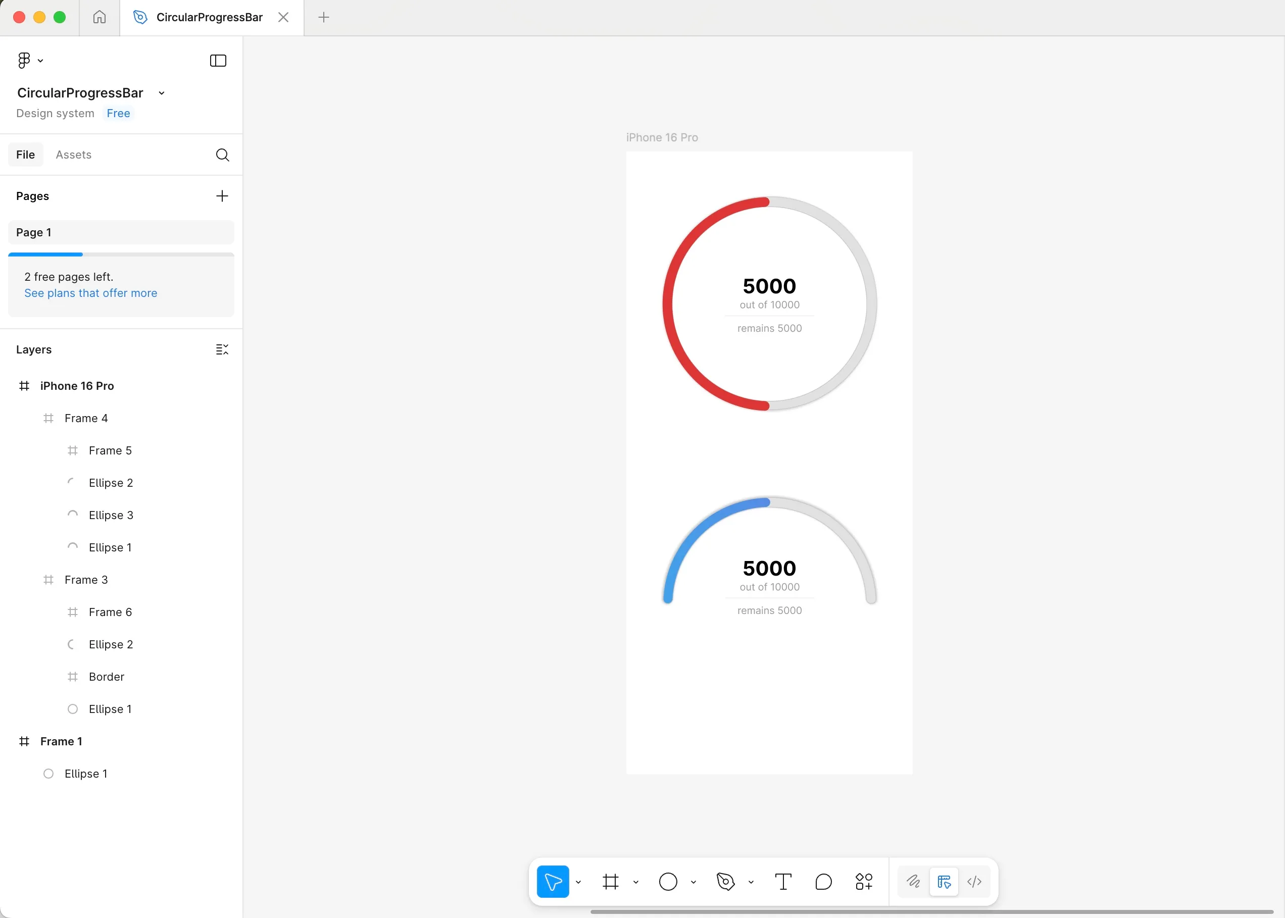
How to make Circular Progress Bar in SwiftUI
We’ve all been here. You want to display progress to a user, but SwiftUI’s built-in ProgressView isn’t flexible enough. That’s a common pain point with many of Apple’s pre-built view components.
Follow this guide to learn how to easily create fully custom circular and half-circular progress bars—just like your designers sketched in Figma.
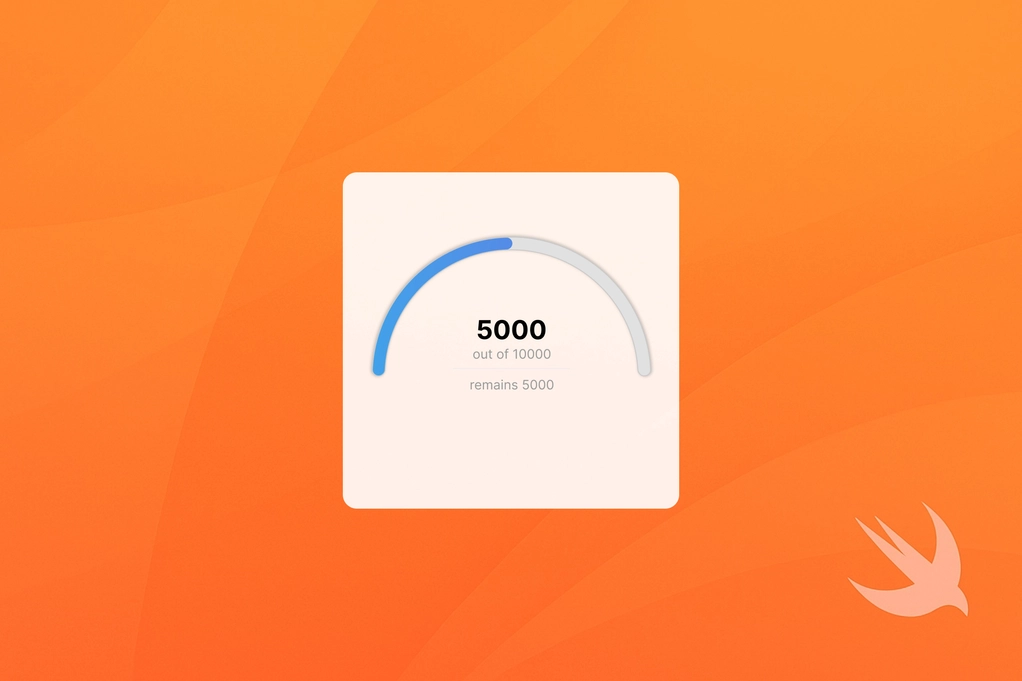
Design specs
When closely examining the picture above, we find that the following applies to both progress bars:
- They are filled with a default light gray color.
- They have a subtle outer shadow.
- They have a 1 pt border with black color at 15% opacity.
- The progress indicator has rounded edges and is filled with either a solid red color or a blue gradient.
- There is information text in the middle of the progress bars.
Coding
Let’s start with some project preparation to make our lives a little easier. Then we’ll move on to creating the actual progress bars, adding the info view, and finally building the screen that displays them.
Preparation
First, let’s define all the colors we’ll need up front, so we don’t have to keep switching back and forth to look up RGB values.
import SwiftUI

extension Color {

    static let greyPrimary = Color(red: 225/255, green: 225/255, blue: 225/255)
    static let greySecondary = Color.black.opacity(0.15)
    static let redPrimary = Color(red: 220/255, green: 52/255, blue: 52/255)
    static let blueGradientColors = [
        Color(red: 66/255, green: 161/255, blue: 234/255),
        Color(red: 103/255, green: 118/255, blue: 227/255)
    ]

}
We’ll also define a StrokeStyle extension to give our circles rounded edges.
import SwiftUI

extension StrokeStyle {

    static func barStrokeStyle(_ width: CGFloat) -> StrokeStyle {
        return StrokeStyle(
            lineWidth: width,
            lineCap: .round,
            lineJoin: .round
        )
    }

}
Now let’s move on to creating the progress bars.
Circular Progress Bar
We’ll start by creating the circular progress bar view, as that one is a little bit easier. After that, we’ll tackle the half circular progress bar view.
Start by creating a reusable view that takes in progress and selectionColor as parameters. This allows us to set these values from outside the view component.
import SwiftUI

struct CircularProgressBar: View {

    let progress: Float
    var selectionColor: Color

    var body: some View {
        ...
    }

}
We can easily draw a circle in SwiftUI, using the Circle() object. We’ll need three Circle objects stacked on top of each other, wrapped in a ZStack. One for border and a shadow, one for default fill of the progress bar and the last one for the progress indicator.
The first circle will display the border and shadow. It should be a little thicker than the other two, so the border is visible. Here, we’ll use the StrokeStyle extension we created, calling it with .barStrokeStyle(14).
Circle()
    .stroke(style: .barStrokeStyle(14))
    .foregroundStyle(Color.greySecondary)
    .shadow(
        color: .greyPrimary,
        radius: 3
    )
Use a stroke width of 12 for the other two circles. We’ll use different .foregroundStyle() values.
In addition, we’ll need to trim the progress indicator circle up to the amount of the progress variable. Note, that the trim modifier takes in values from and to, which expect a fraction value ranging from 0.0 to 1.0. If you pass in values outside of that range, it will treat them as 0.0 or 1.0 respectively. Next, if you run the code, you’ll notice that the progress starts filling from the right side of the circle. To have it start from the bottom, we need to add a .rotationEffect() and rotate the progress indicator by 90 degrees.
Here’s the full CircularProgressBar view.
import SwiftUI
struct CircularProgressBar: View {
let progress: Float
var selectionColor: Color
var body: some View {
ZStack {
Circle()
.stroke(style: .barStrokeStyle(14))
.foregroundStyle(Color.greySecondary)
.shadow(
color: .greyPrimary,
radius: 3
)
Circle()
.stroke(style: .barStrokeStyle(12))
.foregroundStyle(Color.greyPrimary)
Circle()
.trim(from: 0, to: CGFloat(self.progress))
.stroke(style: .barStrokeStyle(12))
.foregroundStyle(selectionColor)
.rotationEffect(.degrees(90))
}
}
}
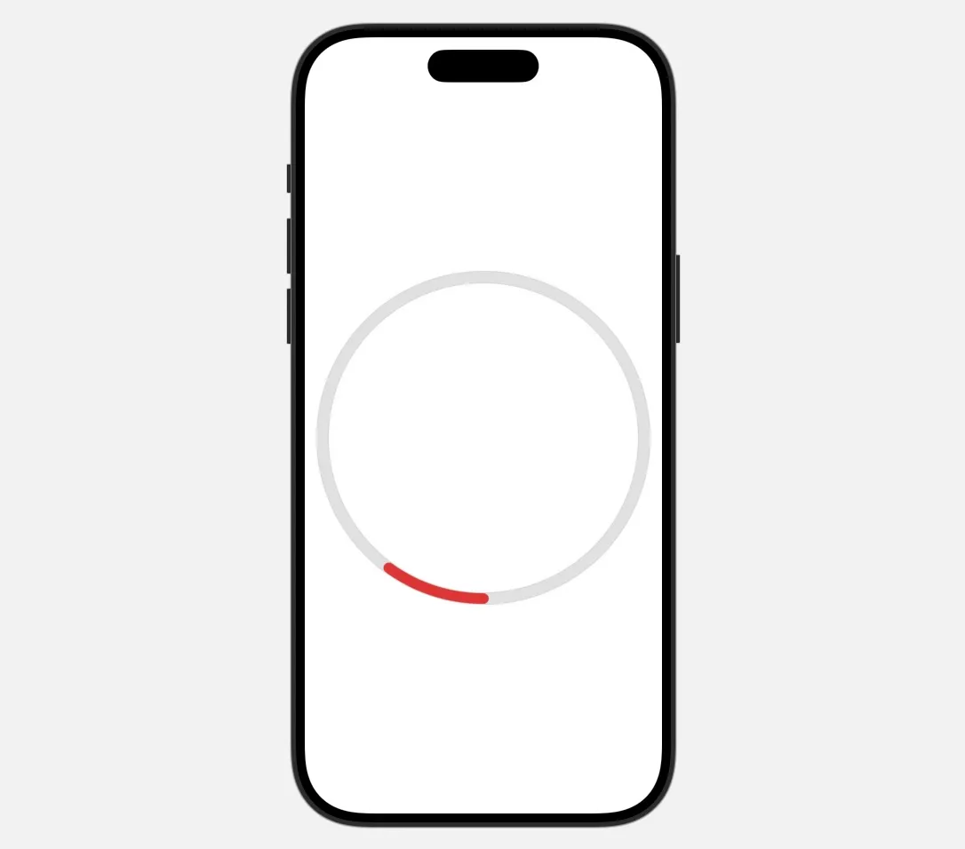
struct CircularProgressBar_Previews: PreviewProvider {
static var previews: some View {
VStack {
Spacer()
CircularProgressBar(
progress: 0.1,
selectionColor: Color.redPrimary
)
.padding(.horizontal, 20)
.padding(.vertical, 30)
Spacer()
}
}
}Here’s how it looks in Previews:
Half-circular Progress Bar
This one is a little trickier. Our first instinct might be to simply trim all three Circle layers to display only half the circle. Let’s try to do that to find out why that might not be the best idea.
We would have to trim all of the circles from 0 to 0.5, and the progress circle to progress / 2. Also, if you remember, the circles start filling up from the right side and continue clockwise, so if we want them to start on the opposite side, we need to rotate them by 180 degrees.
import SwiftUI

struct WrongHalfCircularProgressBar: View {

    ...

    var body: some View {
        ZStack {
            Circle()
                .trim(from: 0, to: 0.5)
                .stroke(style: .barStrokeStyle(14))
                .foregroundStyle(Color.greySecondary)
                .shadow(
                    color: .greyPrimary,
                    radius: 3
                )
                .rotationEffect(.degrees(180))

            Circle()
                .trim(from: 0, to: 0.5)
                .stroke(style: .barStrokeStyle(12))
                .foregroundStyle(Color.greyPrimary)
                .rotationEffect(.degrees(180))

            Circle()
                .trim(from: 0, to: CGFloat(self.progress / 2))
                .stroke(style: .barStrokeStyle(12))
                .foregroundStyle(selectionColor)
                .rotationEffect(.degrees(180))
        }
    }

}

struct WrongHalfCircularProgressBar_Previews: PreviewProvider {

    static var previews: some View {
        VStack {
            Spacer()

            WrongHalfCircularProgressBar(
                progress: 1000/10000
            )
            .frame(width: 300, height: 150)
            .background(Color.yellow)

            Spacer()
        }
    }

}
At first glance, this seems like it should work, so let’s run the Preview:
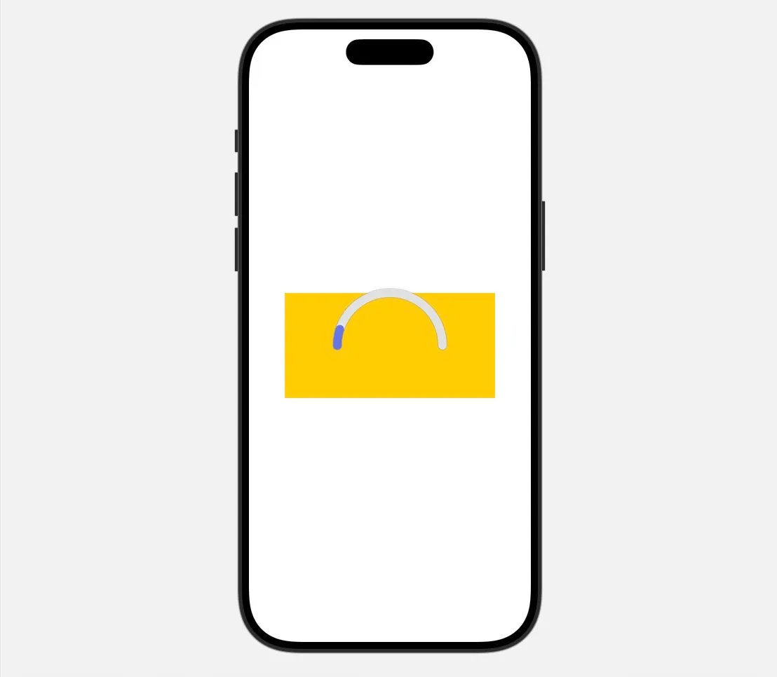
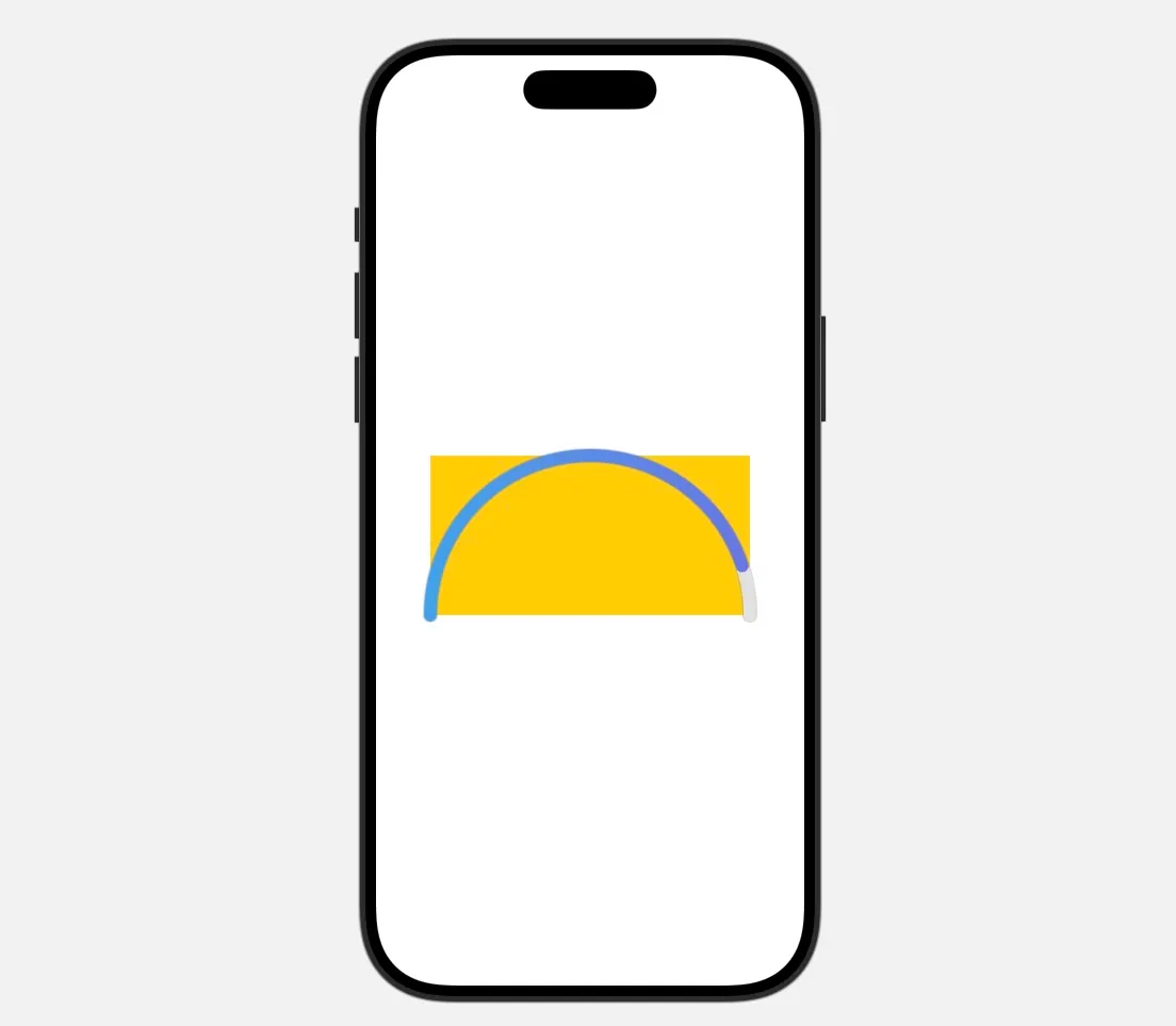
Note: I’ve added a yellow background to the progress bar view in Previews to highlight the issue. The progress bar only occupies the top half of the entire view. You could work around this, but it significantly complicates spacing and padding in your app, so it’s better to find a cleaner solution. Luckily, it’s not too difficult.
Fixed Half-circular Progress Bar
Path to the rescue!
Let’s create a new HalfCircle view, that conforms to Shape and implements func path(in rect: CGRect) -> Path. In that function, we’ll create a new Path and use addArc. We’ll center the arc horizontally at rect.midX and vertically at rect.maxY (the bottom of the container). The startAngle will be 180 degrees so the arc starts on the left and ends on the right.
import SwiftUI

struct HalfCircle: Shape {

    func path(in rect: CGRect) -> Path {
        var path = Path()
        path.addArc(
            center: CGPoint(x: rect.midX, y: rect.maxY),
            radius: min(rect.width, rect.height),
            startAngle: .degrees(180),
            endAngle: .degrees(0),
            clockwise: false
        )
        return path
    }

}
Then, instead of using Circle() object, we’ll use our custom HalfCircle(). In addition, we don’t need to be calling .rotationEffect, as HalfCircle already does that for us.
var body: some View {
HalfCircle()
    .trim(from: 0, to: CGFloat(self.progress))
    .stroke(style: .barStrokeStyle(12))
    .foregroundStyle(selectionGradient)
You may notice that we’ve used a new variable—selectionGradient— which isn’t defined yet. Let’s define it so we can add gradient support to our progress bar.
Here’s the full HalfCircularProgressBar view.
import SwiftUI

struct HalfCircularProgressBar: View {

    let progress: Float
    var selectionColor: Color?

    private var selectionGradient: LinearGradient {
        if let selectionColor {
            return LinearGradient(
                colors: [selectionColor],
                startPoint: .leading,
                endPoint: .trailing
            )
        }

        return LinearGradient(
            colors: Color.blueGradientColors,
            startPoint: .leading,
            endPoint: .trailing
        )
    }

    var body: some View {
        ZStack {
            HalfCircle()
                .stroke(style: .barStrokeStyle(14))
                .foregroundStyle(Color.greySecondary)
                .shadow(
                    color: .greyPrimary,
                    radius: 3
                )

            HalfCircle()
                .stroke(style: .barStrokeStyle(12))
                .foregroundStyle(Color.greyPrimary)

            HalfCircle()
                .trim(from: 0, to: CGFloat(self.progress))
                .stroke(style: .barStrokeStyle(12))
                .fill(selectionGradient)
        }
    }

}

struct HalfCircularProgressBar_Previews: PreviewProvider {

    static var previews: some View {
        VStack {
            Spacer()

            HalfCircularProgressBar(
                progress: 9000/10000
            )
            .frame(width: 300, height: 150)
            .background(Color.yellow)

            Spacer()
        }
    }

}
Here’s how it looks in Previews:
The progress bar still overflows the yellow container a slightly due to the use of stroke. Stroke adds thickness to both the inside and outside edges of the circle, so the center of the stroke aligns with the edge of the container, while the outer part can overflow. For the sake of this tutorial, we’ll call this “good enough.” However, if you want to prevent any overflow, consider passing the stroke width into the HalfCircle view and recalculating the center and radius of the arc accordingly.
Creating CircularProgressView
Now that we can reliably draw both types of progress bars, we’ll want to add the rest of the information in form of Text, into the middle of the progress bar. We’ll do this by wrapping the (Half)CircularProgressBar together with the Texts in a new View - CircularProgressView.
We will want to pass in to the view progressAmount and totalAmount values. Then, we can define the Views for amounts in infoView() ViewBuilder function as following:
@ViewBuilder
func infoView() -> some View {
    VStack(spacing: 4) {
        Text(String(format: "%.0f", progressAmount))
            .font(
                .system(size: 28, weight: .bold)
            )

        Text("out of \(String(format: "%.0f", totalAmount))")
            .font(.system(size: 14))

        Divider()

        Text("remaining \(String(format: "%.0f", totalAmount - progressAmount))")
            .font(.system(size: 14))
    }
}
Display the CircularProgressBar and infoView() together in a ZStack, and set maxWidth on infoView so that the text does not overflow to the sides, if it’s too big - you can play around with this based on your own business and UI requirements.
import SwiftUI

struct CircularProgressView: View {

    let progressAmount: Float
    let totalAmount: Float

    var body: some View {
        ZStack {
            CircularProgressBar(
                progress: progressAmount / totalAmount,
                selectionColor: .redPrimary
            )

            infoView()
                .frame(maxWidth: 158)
        }
    }

    @ViewBuilder
    func infoView() -> some View {
        ...
    }

}

#Preview {
    CircularProgressView(
        progressAmount: 5000,
        totalAmount: 10000
    )
    .frame(width: 300, height: 300)
}
To align the HalfCircularProgressBar together with the infoView(), you need to set the padding on the infoView() to account the the fact, the Half Progress bar is half the height of the full size circle.
var body: some View {
    ZStack {
        HalfCircularProgressBar(
            progress: progressAmount / totalAmount
        )

        infoView()
            .padding(.bottom, -80)
            .frame(maxWidth: 158)
    }
}
Displaying both progress bars on one screen
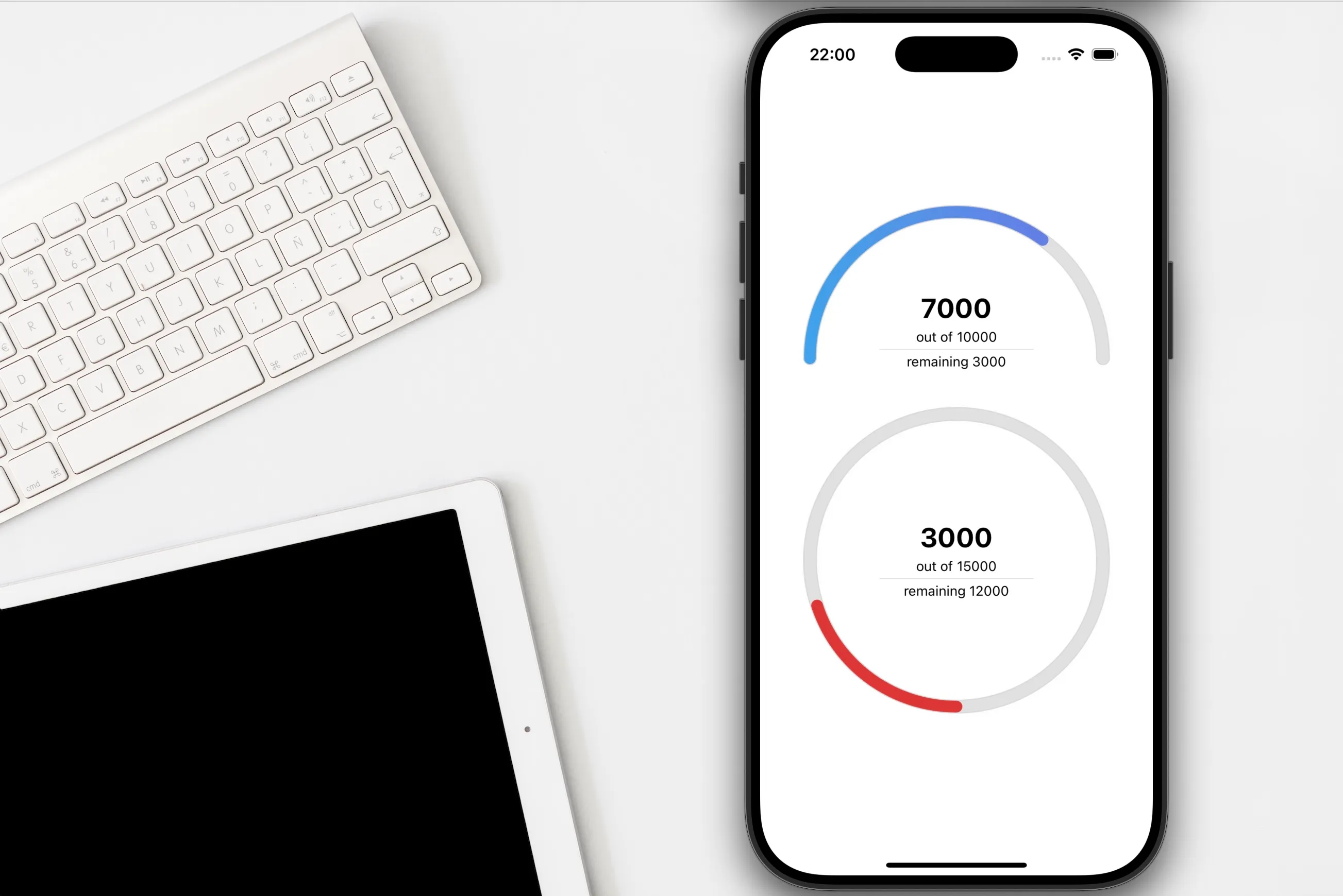
Let’s add both progress bars into one VStack, so that we can see how they look next to each other.
import SwiftUI

struct ProgressBarsView: View {

    var body: some View {
        VStack(spacing: 50) {
            HalfCircularProgressView(
                progressAmount: 7000,
                totalAmount: 10000
            )
            .frame(width: 300, height: 150)

            CircularProgressView(
                progressAmount: 3000,
                totalAmount: 15000
            )
            .frame(width: 300, height: 300)
        }
    }

}
Results
Tips
-
Extend HalfCircle
- You could extend HalfCircle to draw any portion of a circle—even 2/3 of a circle.
- As mentioned before, stroke can cause HalfCircle to overflow its parent view boundaries. You can update it to always stay within its parent view.
-
Add animations
- For a more engaging user experience, animate the progress value using
withAnimationor SwiftUI’s.animationmodifier. Try spring or ease-in-out animations for smooth effects.
- For a more engaging user experience, animate the progress value using
-
Add Accessibility
- Use
.accessibilityLabeland.accessibilityValuemodifiers on your progress bar so that screen readers can describe the current progress to visually impaired users.
.accessibilityLabel("Progress") .accessibilityValue("\(Int(progress * 100)) percent") - Use
Conclusion
Unfortunately, Apple doesn’t always provide components that fully suit our needs. Luckily, in this case, it’s pretty easy to create your own circular progress bar in SwiftUI.
Happy and efficient coding!